Leopard Gecko website feedback please!

UnicornSpirit

Graphic Designer
Messages
399
Location
Woodbine, MD
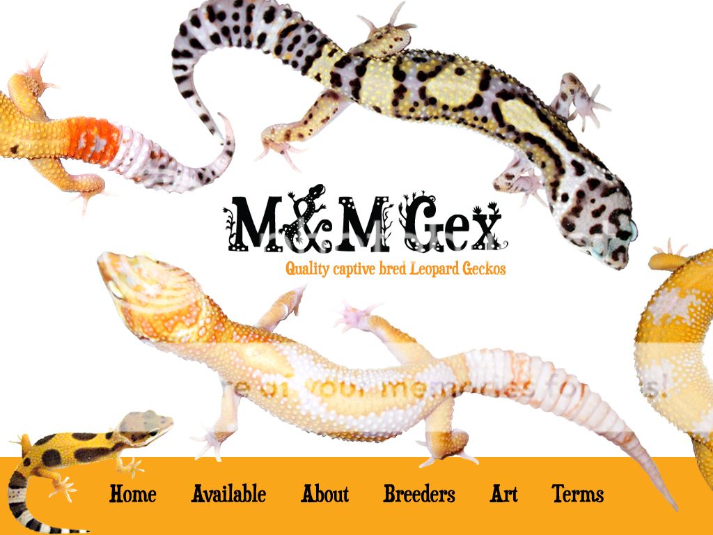
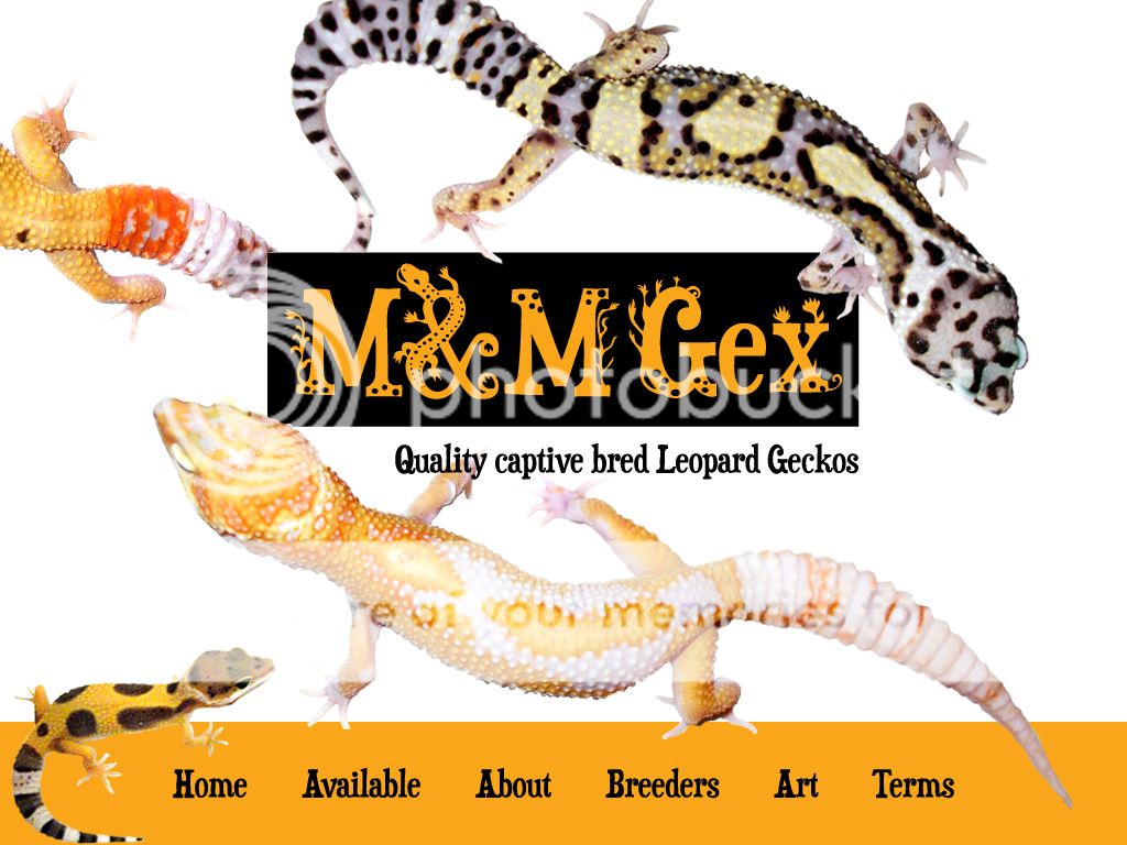
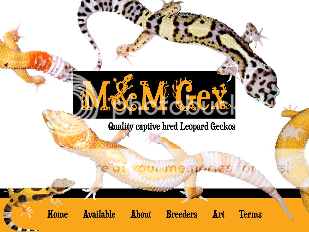
Hey guys! I'll keep this thread updated as I go. Tonight I worked on my logo and the index page for my gecko hobby website. I plan on selling leopard geckos as well as some of my art on this site. "M&M" are my initials. I kept trying to come up with a bad-ass name for my little gecko hobby but nothing came to mind so I went sort of generic. The plants integrated with the font are influenced from the countryside woods I live in.

Any constructive criticism is appreciated!

DESIGN A
mmgex_title.jpg
 
Last edited:

justindh1

New Member
Messages
1,584
Location
Pilot Grove, Missouri
It seems that website feedback are one of those things that people don't like to comment on. Not sure why.

I think overall your design looks good. I find your logo very appealing and it really grabs your attention. To me, your front page is balanced heavily to the left. The arrangement of the geckos should be adjusted to show an equal weight balance that doesn't make the viewers eye want to veer left. You might also want to experiment with adding a border to the orange background to your menu bar. That or just a single line on the top edge that is in the back layer behind the geckos. Hope this helps.
 

UnicornSpirit

Graphic Designer
Messages
399
Location
Woodbine, MD
It seems that website feedback are one of those things that people don't like to comment on. Not sure why.

I think overall your design looks good. I find your logo very appealing and it really grabs your attention. To me, your front page is balanced heavily to the left. The arrangement of the geckos should be adjusted to show an equal weight balance that doesn't make the viewers eye want to veer left. You might also want to experiment with adding a border to the orange background to your menu bar. That or just a single line on the top edge that is in the back layer behind the geckos. Hope this helps.


People are scared they'll hurt my feelings I guess. It doesn't bug me though. Thanks for the feedback. How about now?
DESIGN B
mmgex_title-1.jpg
 
Last edited:

SamsonizeMe

New Member
Messages
355
Location
Coconut Creek, FL
The change to the ampersand helps. I might try playing with its size relative to the caps; it is a little overpowering at the moment. A slight texture instead of the white background could also offer some appeal. Try shifting your tagline out from underneath the logo (to the right) to get some more balance to the right?

I'm a designer as well, take it or leave it.
 
Last edited:

Enigmatic_Reptiles

Quality is Everything
Messages
6,779
Location
Corona, CA
I like the logo but all the leos make it look too busy for my liking. If you were to remove the two partial leos and have your tabs have rollover images with a gecko or part (scales, eyes, ct, etc.) that it would look better imo. I by no means am a web expert I just know that for my eyes I don't know where to look, which doesn't sell me on your business/logo. I see nice leos but when im done looking I wouldn't remember your business name. A lot going on and a lot of bright whites.
 

justindh1

New Member
Messages
1,584
Location
Pilot Grove, Missouri
I think what this shows you is that everyone has a different opinion. Just take it the way you want it or make up a couple different variations and have a poll vote for the best one.

I really do like this one though.

People are scared they'll hurt my feelings I guess. It doesn't bug me though. Thanks for the feedback. How about now?

mmgex_title-1.jpg
 

Visit our friends

Top